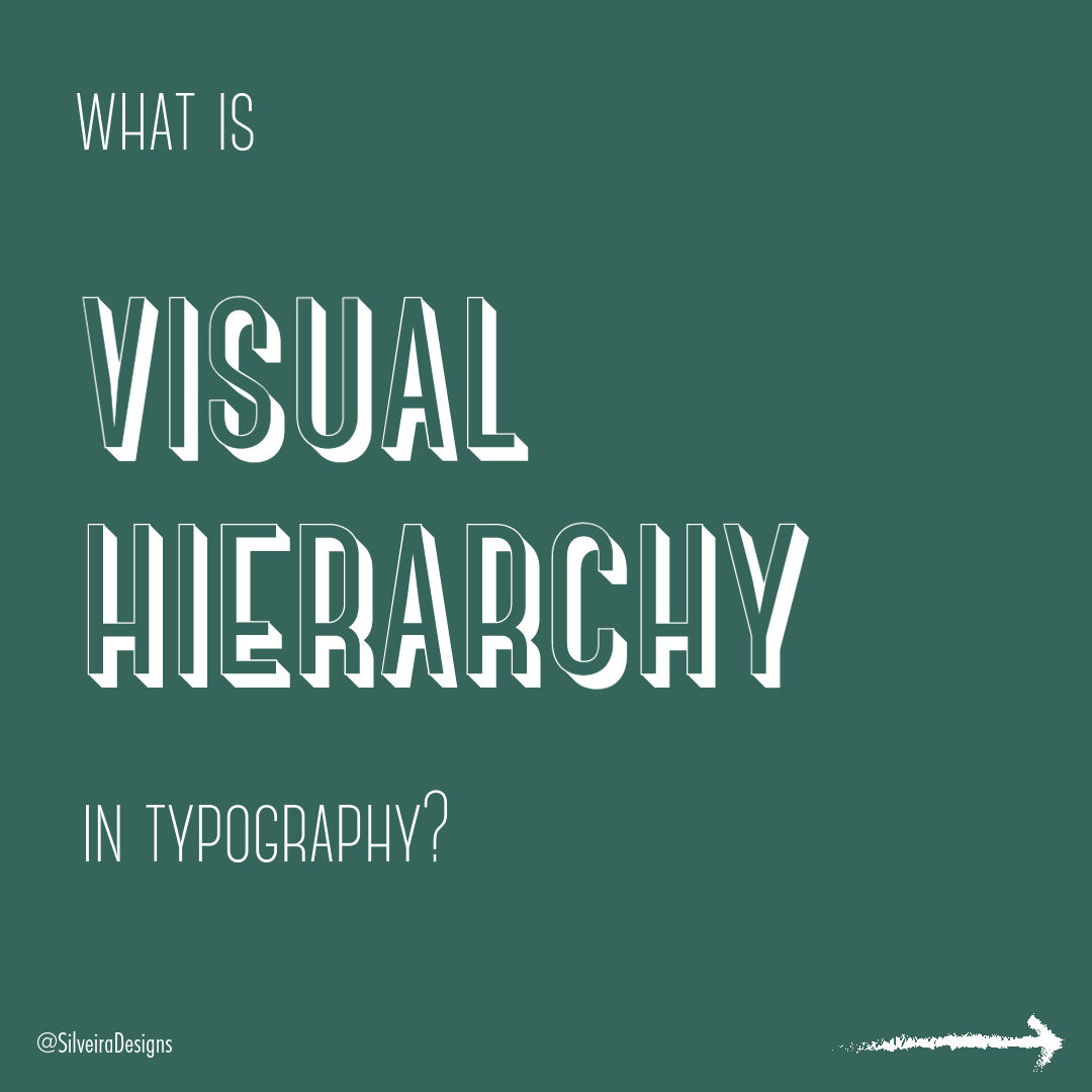
What is Visual Hierarchy in typography?
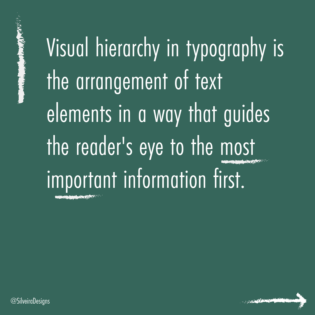
By definition, visual hierarchy is is the arrangement of text elements in a way that guides the reader's eye to the most important information first.
It is created using a variety of techniques, such as font size, weight, color, spacing, and alignment.
A well-designed visual hierarchy will make your text more readable and engaging. It will also help readers to quickly find the information they are looking for.
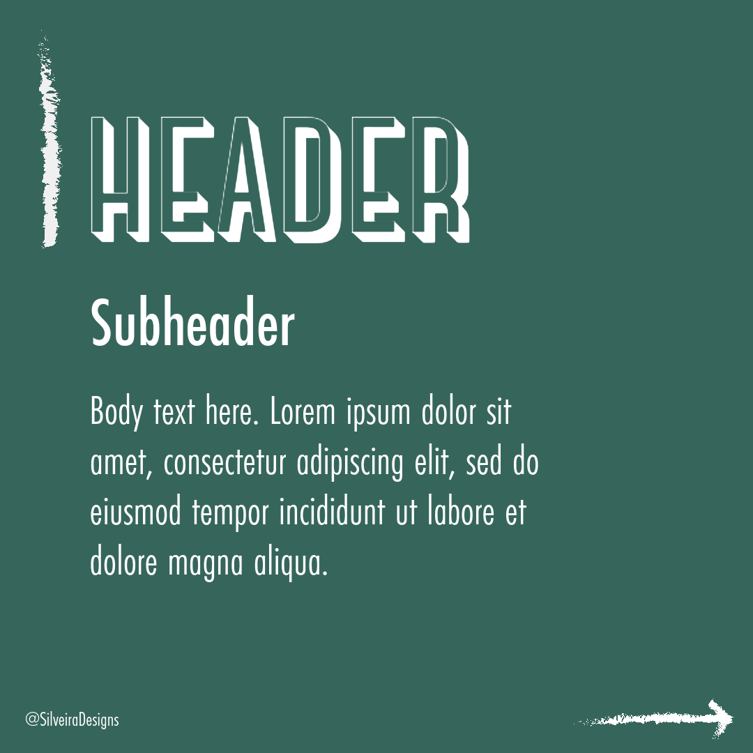
Typically, any piece of design has an outline of:
Header
Sub header
Body text.
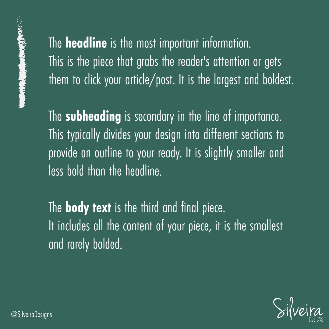
The headline is the most important information.
This is the piece that grabs the reader's attention or gets them to click your article/post. It is the largest and boldest.
Think book titles, magazine titles, newsletter headers, website headers.
The subheading is secondary in the line of importance.
This typically divides the design into different sections to provide an outline to your ready. It is slightly smaller and less bold than the headline. These can help break up text-heavy newsletters, articles, or magazine spreads.
The body text is the third and final piece.
It includes all the content of your piece, it is the smallest and rarely bolded. It’s the bulk of your copy. It should be a readable size and a easy-to-read font.
By following these few tips, you can create a visual hierarchy that will make your text more readable, engaging, and user-friendly.
If you’re looking for additional guidance on visual hierarchy in your next project, contact me today and let’s chat.
Sources:
"The Principles of Visual Hierarchy in Design" by 99designs