5 Principles of Layout Design
Layout design part 1: Principles of Layout Design
First things first, a recap:
Layout design is the art of arranging elements on a page or screen in a way that is visually appealing and functional. It is a critical part of any design project, from print to digital.
The goal of layout design is to create a cohesive and balanced composition that draws the viewer's eye to the most important information.
What are some ways we can achieve that?
To start, here are the 5 principles of layout design to help guide you:
Hierarchy: This principle refers to the arrangement of elements in order of importance. The most important elements should be given the most prominence, while less important elements should be de-emphasized.
What does your headline say? Is the font readable? Are you showing the most important thing first?Alignment: This principle refers to the alignment of elements on the page. Elements should be aligned in a way that is visually pleasing and easy to read.
Oftentimes people like how middle-aligned text looks. But in all honesty, it’s harder to read and people can get lost in moving to the next line. In some cases, middle alignment can be effective. Think wedding invitations, less type-heavy situations.Depending on where you live, your natural alignment for reading (left or right) is usually the best go-to option.
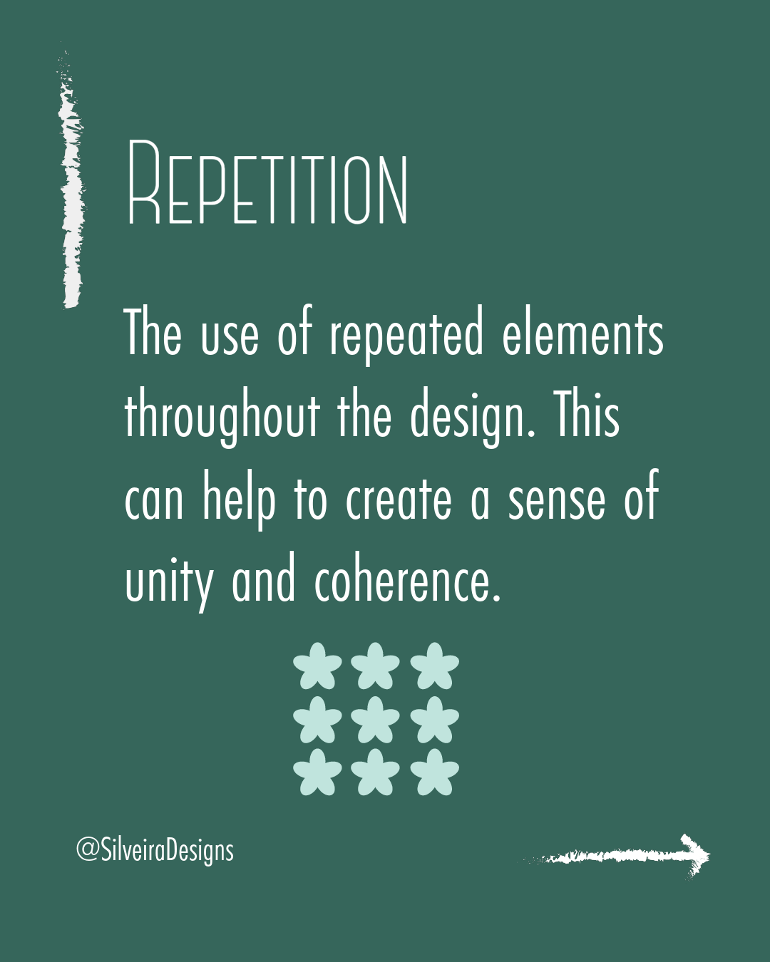
Repetition: This principle refers to the use of repeated elements throughout the design. This can help to create a sense of unity and coherence.
If you’re using certain icons or patterns, have them repeat cohesively. That might be through the same column spacing. If you have multiple rows of icons, make sure it’s evenly spaced and within the same alignment.Contrast: This principle refers to the use of contrasting elements to create visual interest. Contrast can be created by using different colors, shapes, or sizes.
If everything is one-note, it won’t be enticing. Using contrasting colors and/or fonts can bring more attention to your design.White space: This principle refers to the use of space in the design. White space can help to make the design more visually appealing and easy to read.
This one seems to be tough for clients. They often feel like they need to fill the entire page to get the bang for their buck. White space is essential for allowing your items to breathe and have balance within the design.
Which principle do you find yourself using the most?
What about the least?
If you’re looking for assistance on creating effective layout design, contact me today.