Color Harmony
Color Importance: Part 3+ Color Harmony
What is color harmony?
Color harmonies are specific combinations of colors that create pleasing and aesthetically balanced visual effects.
Choosing your brand colors doesn’t have to be as daunting as it seems.
Does it take some thought? Yes
Does it have to be complicated? No
Should your colors have balance and harmony? Yes
Here are some common types of color harmonies:
Analogous: This harmony uses three or more colors that are next to each other on the color wheel, such as blue, blue-green, and green. These adjacent colors create a sense of calmness and unity.
Monochromatic: This harmony uses only one hue or color and its lighter or darker variations. This means one color is used with different amounts of black and white.They can create a sense of calm and serenity
Complimentary: This harmony uses two colors that are directly opposite each other on the color wheel, such as red and green or blue and orange. These contrasting colors create a sense of vibrancy and energy.
Triad: This harmony uses three colors that are evenly spaced around the color wheel, such as red, yellow, and blue. This combination creates a vibrant and balanced visual effect.
Shades: Shades are created by adding black to a pure color. For example, adding black to red will create progressively darker shades of red, such as dark red, maroon, and burgundy. Shades are often used to create depth and dimension in designs.
Split Complementary: A split complementary color scheme is a variation of the complementary color scheme that uses two colors that are adjacent to the complementary color on the color wheel. For example, the split complementary colors for red are blue-green and yellow-green. This scheme creates a more balanced and harmonious visual effect than the traditional complementary scheme.
Double Complementary: A double complementary color scheme is a variation of the complementary color scheme that uses two complementary pairs of colors. For example, the double complementary colors for red are blue and green, and yellow and orange. This scheme creates a more complex and vibrant visual effect than the traditional complementary scheme.
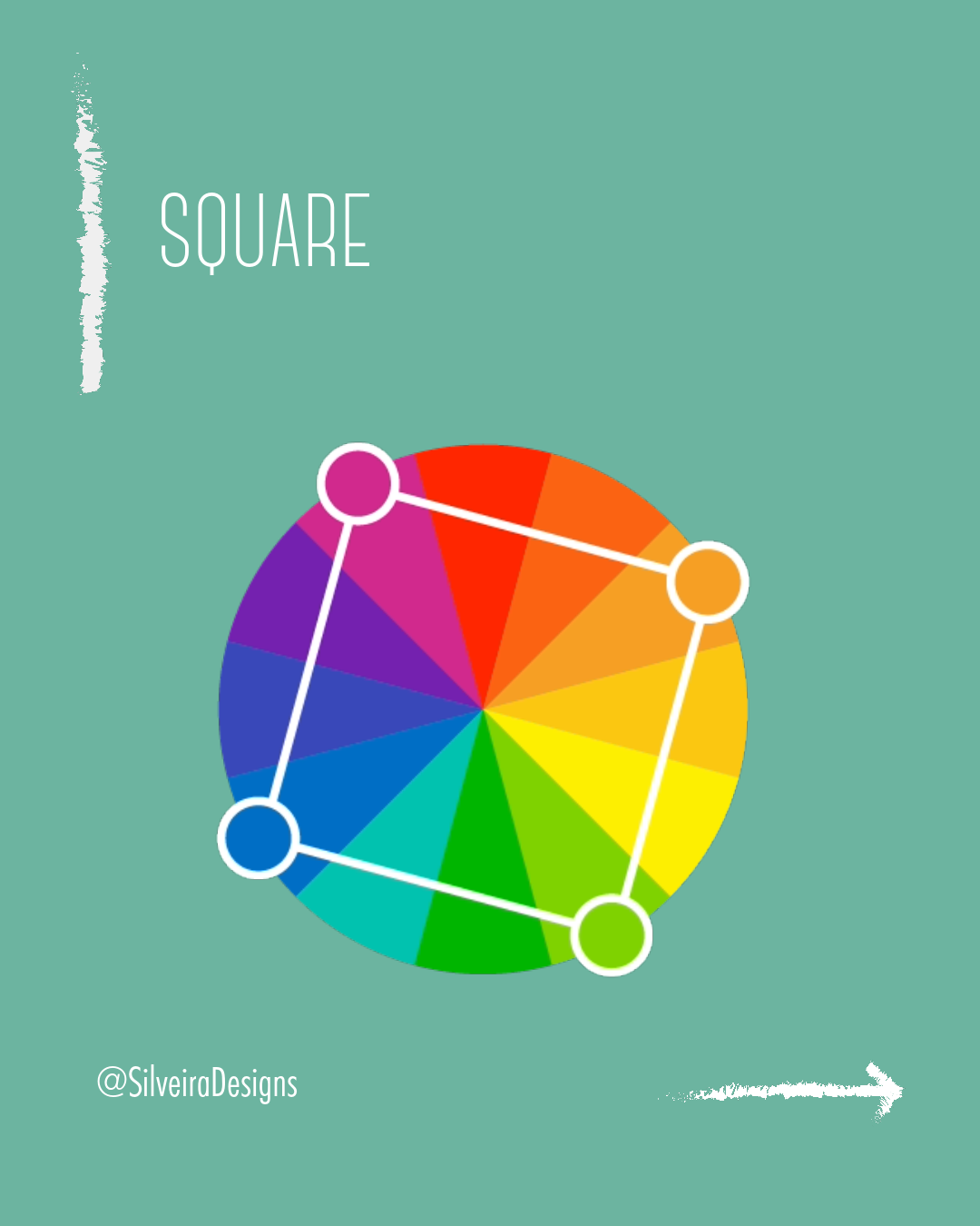
Square: A square color scheme is a variation of the triadic color scheme that uses four colors that form a square on the color wheel. For example, the square colors for red are blue, yellow, and green. This scheme creates a balanced and harmonious visual effect with a touch of vibrancy.
Compound: A compound color scheme is a variation of the triadic and tetrad color schemes that uses six or eight colors, respectively. For example, a compound triadic color scheme for red would include blue, yellow, green, red-orange, red-violet, and yellow-green. This scheme creates a rich and complex visual effect with a variety of color relationships.