Color Meanings
Color Importance: Part 2
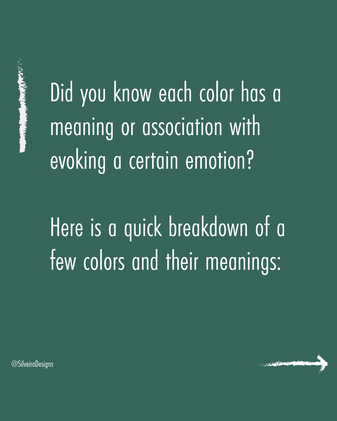
Did you know each color has a meaning or association with evoking a certain emotion?
How often do you find your self emotionally compelled to purchase something, or be attracted to a certain brand?
Color choice for your logo and brand is an integral part of the visual identity puzzle.
When deciding on a color palette for your brand, think of how you want your customers to feel with they see and/or interact with your brand.
Here is a quick breakdown of a few colors and their meanings to help guide you:
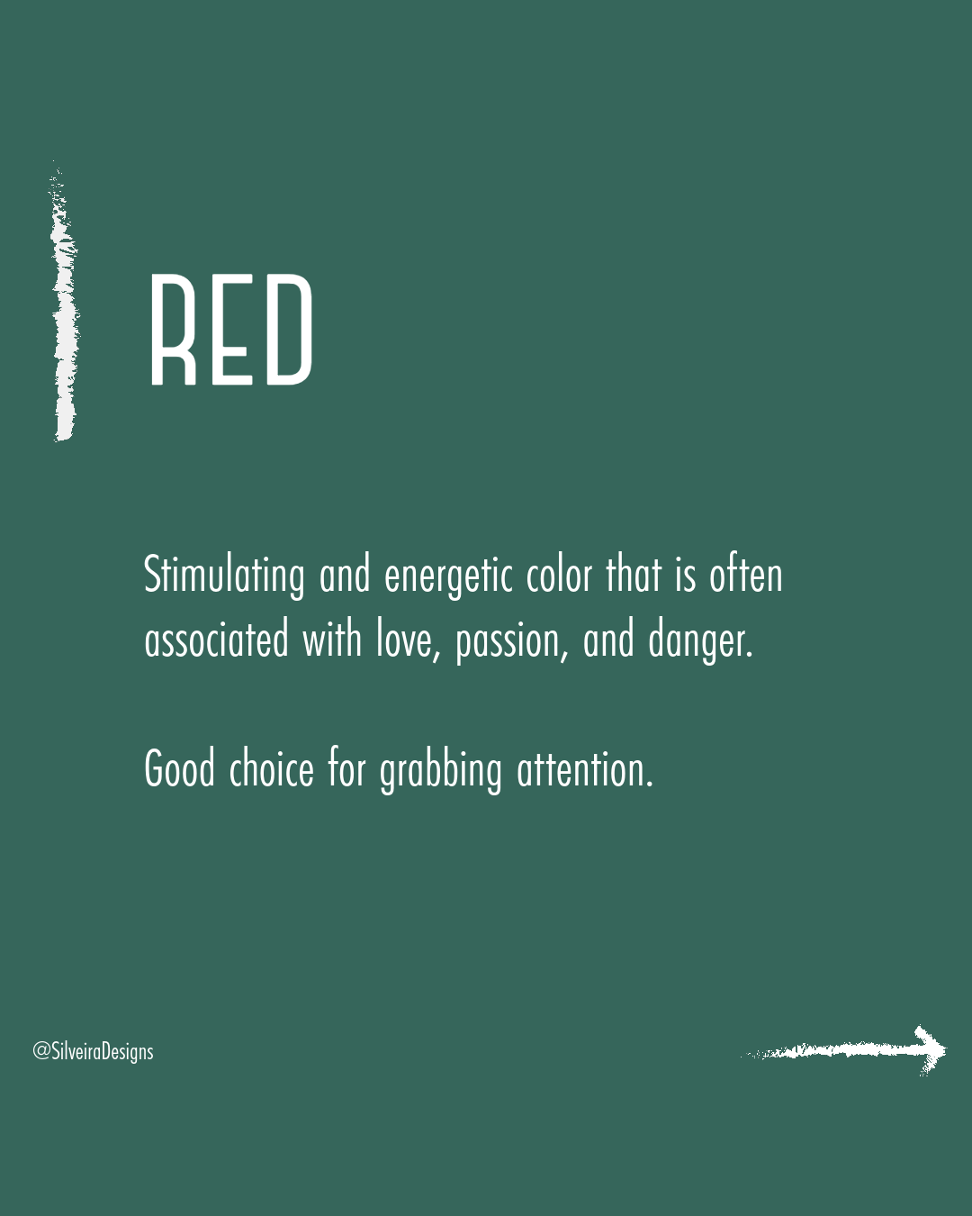
🔴 Red
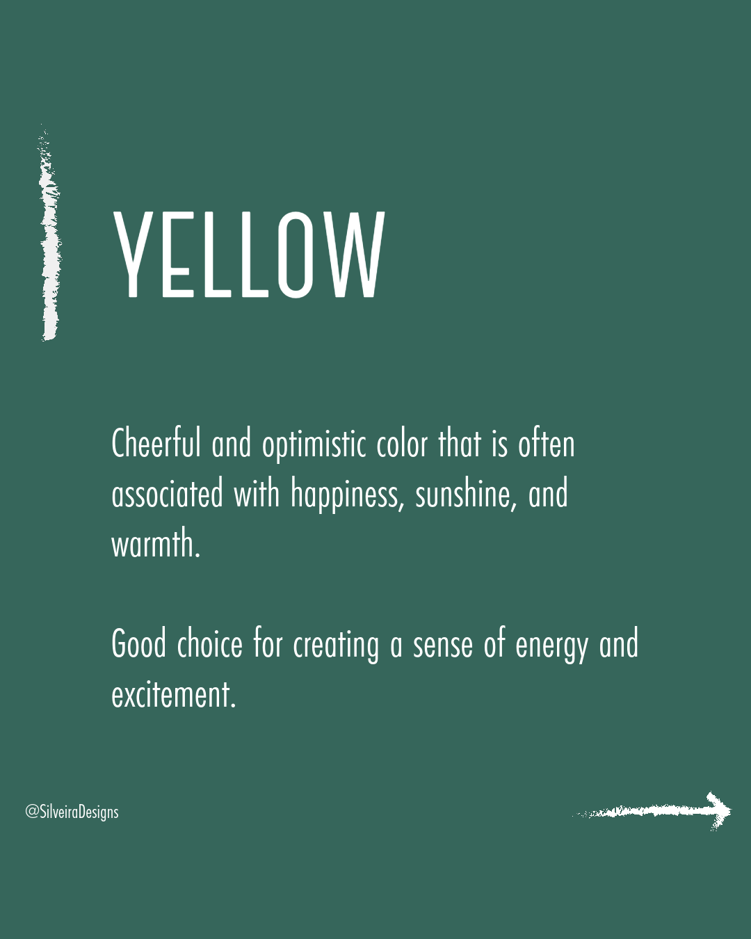
Stimulating and energetic color that is often associated with love, passion, and danger. Good choice for grabbing attention.🟡 Yellow
Cheerful and optimistic color that is often associated with happiness, sunshine, and warmth. Good choice for creating a sense of energy and excitement.🔵 Blue
Calming and relaxing color that is often associated with peace, tranquility, and trust. Good choice for creating a sense of stability and security.🟢 Green
Refreshing and natural color that is often associated with growth, harmony, and balance. Good choice for creating a sense of freshness and vitality.🟠 Orange
Vibrant and energetic color that is often associated with creativity, enthusiasm, and adventure. Good choice for creating a sense of warmth and friendliness.🟣 Purple
Royal and luxurious color that is often associated with mystery, wisdom, and creativity. Good choice for creating a sense of elegance and sophistication.
What are some logos you see using these colors?
Do they evoke the same emotion associated with the color?