5 Tools to up Your Hierarchy Game
Layout Design Part 4: 5 Tools to Create Hierarchy in Your Design.
Hierarchy. One of the 5 principles of layout design.
So we know what hierarchy in layout design is.
Great!
How do we implement it?
Glad you asked!
Here are 5 tools to up your hierarchy game:

SIZE
Use larger sizes for more important elements and smaller sizes for less important ones.
This can be relevant for your typography, images, or graphics. Whatever you want your audience to see first, make that bigger. Create primary, secondary, and tertiary sizings and options.

COLOR
Use brighter or more contrasting colors to draw attention to key elements.
If you have a call-out box or graphic elements to highlight, what colors are you using to bring attention to what’s important? (Keep in mind color meanings also. Peep my color meanings post for a reminder.)
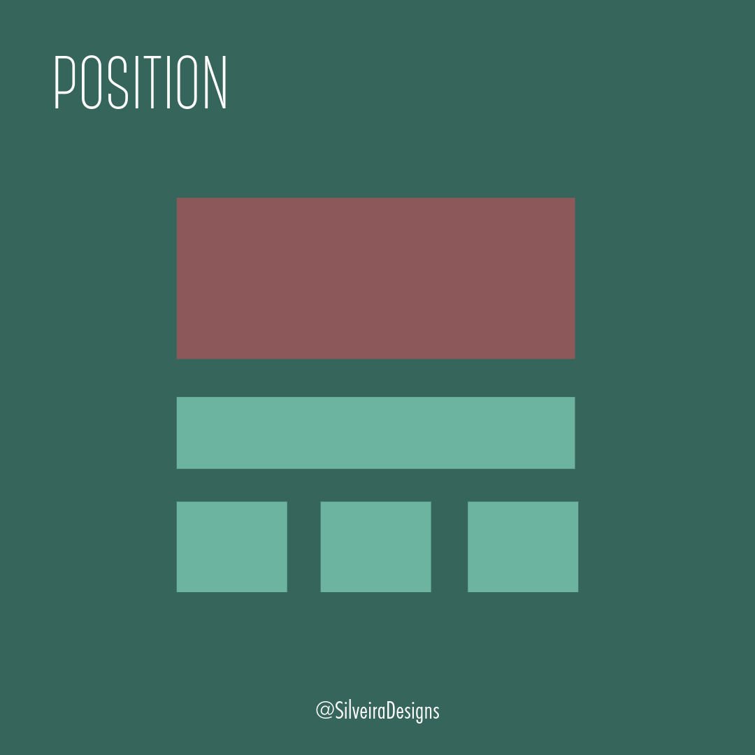
POSITION
Place important elements in prime viewing areas, such as the top or center of the layout.
What’s the first thing your audience sees when they go onto your website or see your brochure? Place the item(s) you want them to see/read at the most prominent place within your design.

WHITESPACE
Use whitespace to create breathing room around important elements and make them stand out.
This element is essential and often the most difficult to convince clients that it’s necessary. Whitespace gives visual breathing room to your design and gives them their space to shine.
Think of your home. Do you want a bunch of knick-knacks to fill every inch of counter space? Or frames to fill every inch of the walls? Just like your home or office space, design needs whitespace.

TYPOGRAPHY
Use different font sizes, weights, and styles to create a hierarchy of headings and subheadings.
As previously noted in my post “Visual hierarchy in typography,” giving your typography hierarchy within your design helps implement effective layout design.
Giving your headers, subheaders and body copy their own, distinct sizing and weight can help guide the reader through what they need to read first, and what they can read last. You don’t need 3 different fonts either – one typeface and using bold/regular weights can help you achieve this. Keep it simple. Keep it clean.
If you’ve been reading this 4-part series about layout design, you’ll notice that some of the above tips on how to create a hierarchy within your design overlap with those principles.
Like contrast in color and whitespace, type and sizing – sometimes they can seem to blend into one another in their usage.
Instead of getting hung up on separating them, one thing I like to remember is that all these principles and elements of design often crossover. It’s like a great basketball team. Each player has their strengths and together they win championships.
So go win a championship!
Use these 5 items as a checklist when designing your work. As you take a look at your progress, go through this checklist and see if your design uses each of these 5.
Looking for some extra guidance in your layout design? Contact me today.