
3 Easy Design Elements to Upgrade Your PDF Documents
And make them be less boring.
Not everything gets printed these days. More often than not, your documents are shared digitally — as an email attachment, a website download, checklist, or maybe even part of a webinar.
But here’s the challenge: how can digital documents make the same impact as a beautifully printed piece?
The answer lies in design. By adding just a few thoughtful design elements, you can make your PDFs easier to navigate, more engaging, and more memorable.
So without further ado, here are 3 simple ways to upgrade your next digital document for that WOW factor:
1. interactive table of contents (using anchor links)
An interactive table of contents is one of the most underrated tools in digital documents–and might be one of my favorites.
It helps readers jump straight to the sections they care about most, making your document more user-friendly.
Video of interactive table of contents within a PDF document.
Even if your PDF isn’t long, this small touch shows you’re thinking of your reader’s experience. It’s especially useful for content-heavy pieces like annual reports, research studies, or impact statements.
Pro tip:
Add a “back to top” feature on each page, so readers can easily return to the table of contents no matter where they are in the document
2. Use Infographics
We all know people skim.
Short attention spans mean readers are drawn to bold visuals, big numbers, and quick takeaways. Anything to make it easier an quicker to read.
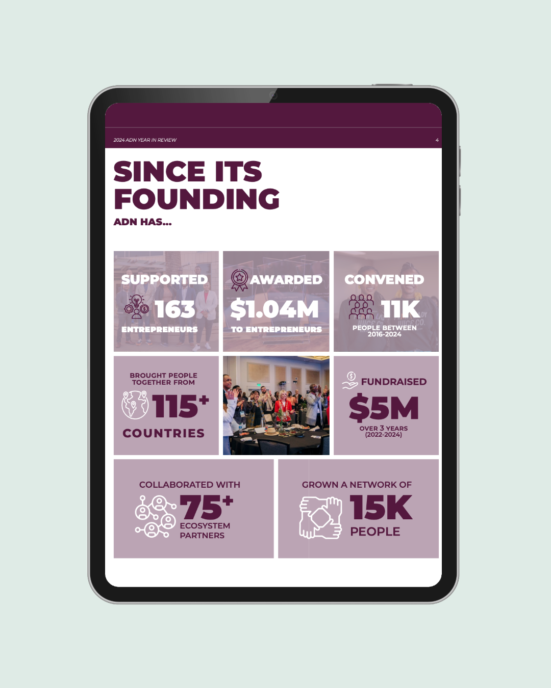
Infographics give you the chance to highlight key statistics, impact numbers, or milestones in a way that grabs attention at first glance.
They’re especially effective in reports for donors or stakeholders, where the goal is to show value quickly and clearly. This also show the reader you’re thinking of them and value their time.
If you have tip #1 set, they can appreciate the direct guide for their journey.
3. Consider a Horizontal Layout
At first, this one might sound a little unusual. Why should the layout matter? But think about how your audience is consuming digital documents. If it’s not printed, where are they viewing it?
Most people are reading on a computer or laptop with a horizontal (landscape) screen. Designing your PDF in a horizontal layout allows readers to view more content at once without constant scrolling or zooming. It’s another way to show that you’ve considered how your audience will interact with your work.
It’s also another way to add variety to your design and implement other layout techniques to make it look especially amazing.
Even if they’re reading on their phone, they can turn it sideways for the same experience.
In short:
Digital doesn’t have to mean dull. With a few intentional design choices, your PDFs can be just as engaging and polished as anything you’d print.
I’m curious, have you implemented these before?